StowQR Onboarding: A Guided First-Run Tour
Open an organization app for the first time and the last thing you want is a blank dashboard with no idea where to start. Starting in version 1.4.0, StowQR opens with a short onboarding carousel that shows exactly what the app can do — before you have to figure it out yourself.
A Guided First Run
The new onboarding is a handful of swipeable cards that introduce the core ideas behind StowQR: label your totes with a QR code, scan to instantly see what's inside, and catalog items with a single photo. Each card uses clean illustrations and a one-line explanation. No walls of text, no tutorials you have to sit through.
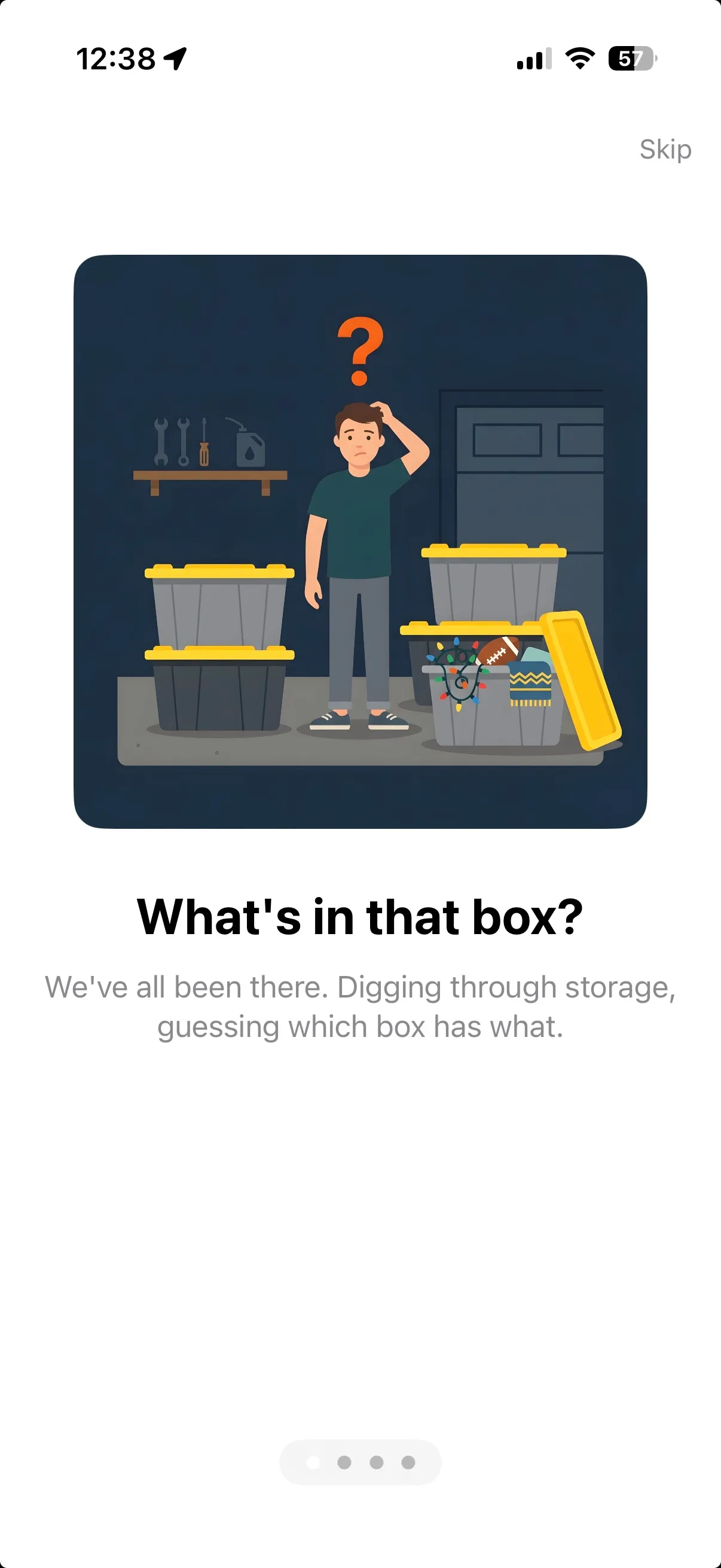
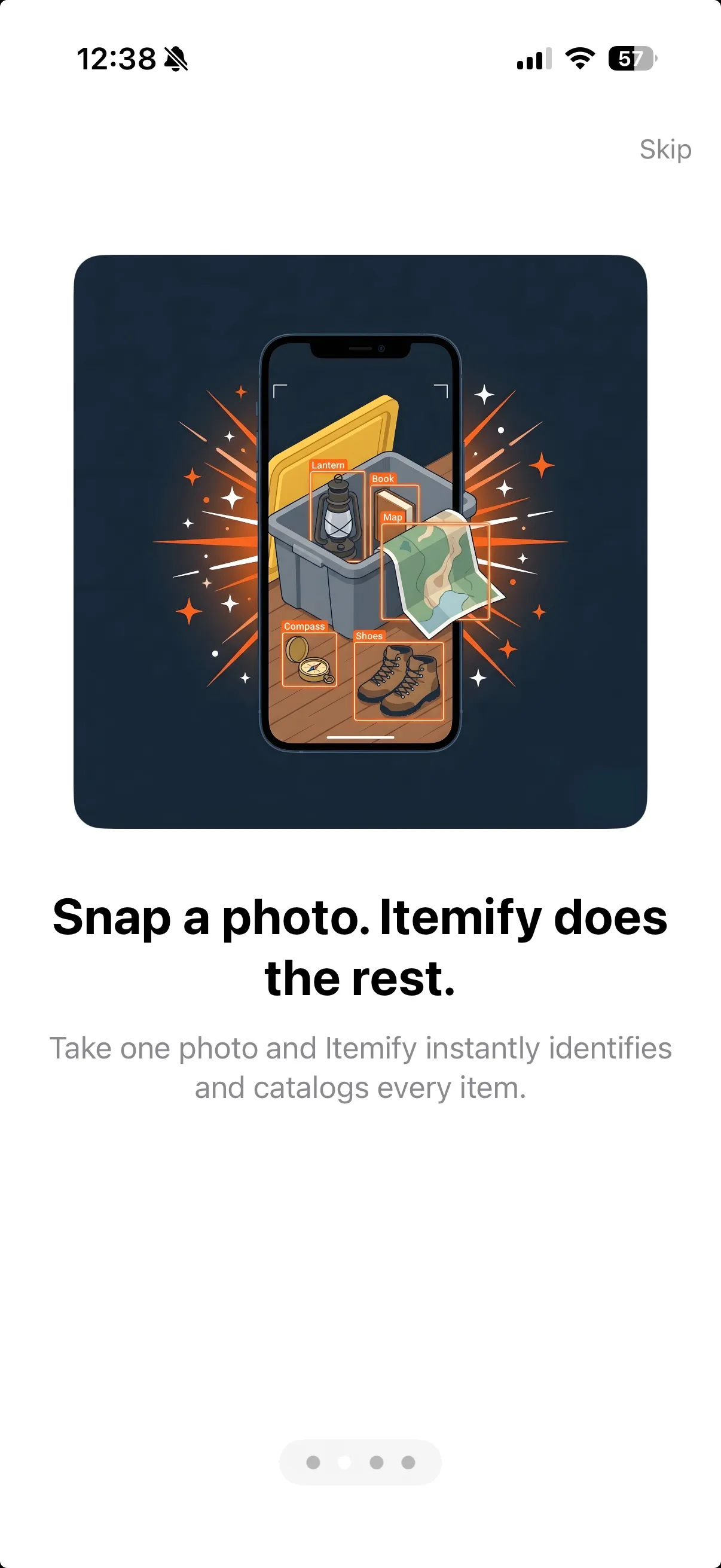
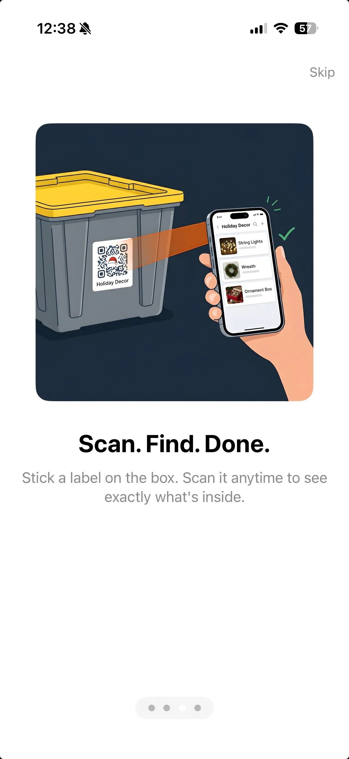
Swipe through the onboarding carousel — a map of the territory before you start.
Subtle Nudges, Not Roadblocks
We wanted the flow to feel inviting, not like homework. Small hints guide you forward between cards, and you can swipe through at your own pace. When you reach the end, you're dropped straight into the app ready to create your first tote — not stranded on a generic welcome screen.
Why We Built It
StowQR does a lot: QR labeling, AI item detection, tote photos, sharing, search. For someone brand new, that breadth can feel like too much. A short onboarding gives you a mental model up front: here's what this app is for, here's how the pieces fit together. From there, everything you click makes more sense.
Try StowQR
The new onboarding ships in StowQR 1.4.0. If it's your first time opening the app, you'll see it automatically. Already a user? Thanks for being here. This one's for the folks just joining us.