StowQR Has a New Look
StowQR used to open on a tab bar. Totes in one tab, Scan in another, Search in a third. It is gone. The app opens on a single screen called Storage, and everything you own is on it.
One Screen, No Tabs
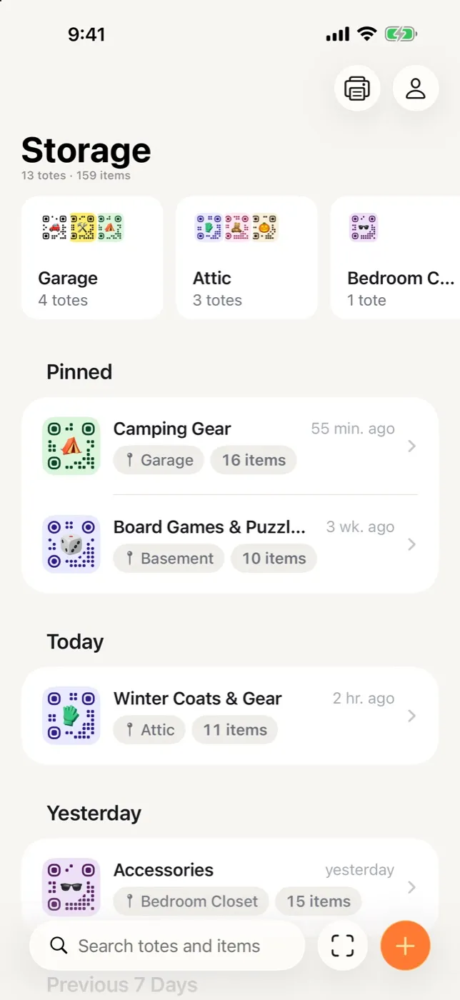
Storage is the root of the app. Places, totes and items push forward from here, and Back always returns you to where you came from.
Search sits in a field at the bottom of the screen, where your thumb already is, with Scan and New tote next to it. Print and your account stay up top.
The list below the place cards works the way Notes does. Pinned totes sit at the top, and the rest fall into Today, Yesterday, Previous 7 Days, Previous 30 Days, then by month. The tote you were filling an hour ago is the first one you see, which is usually the one you wanted. Every row carries its label glyph, its place, and its item count, so you can tell Camping Gear from Winter Coats without opening either.
Places
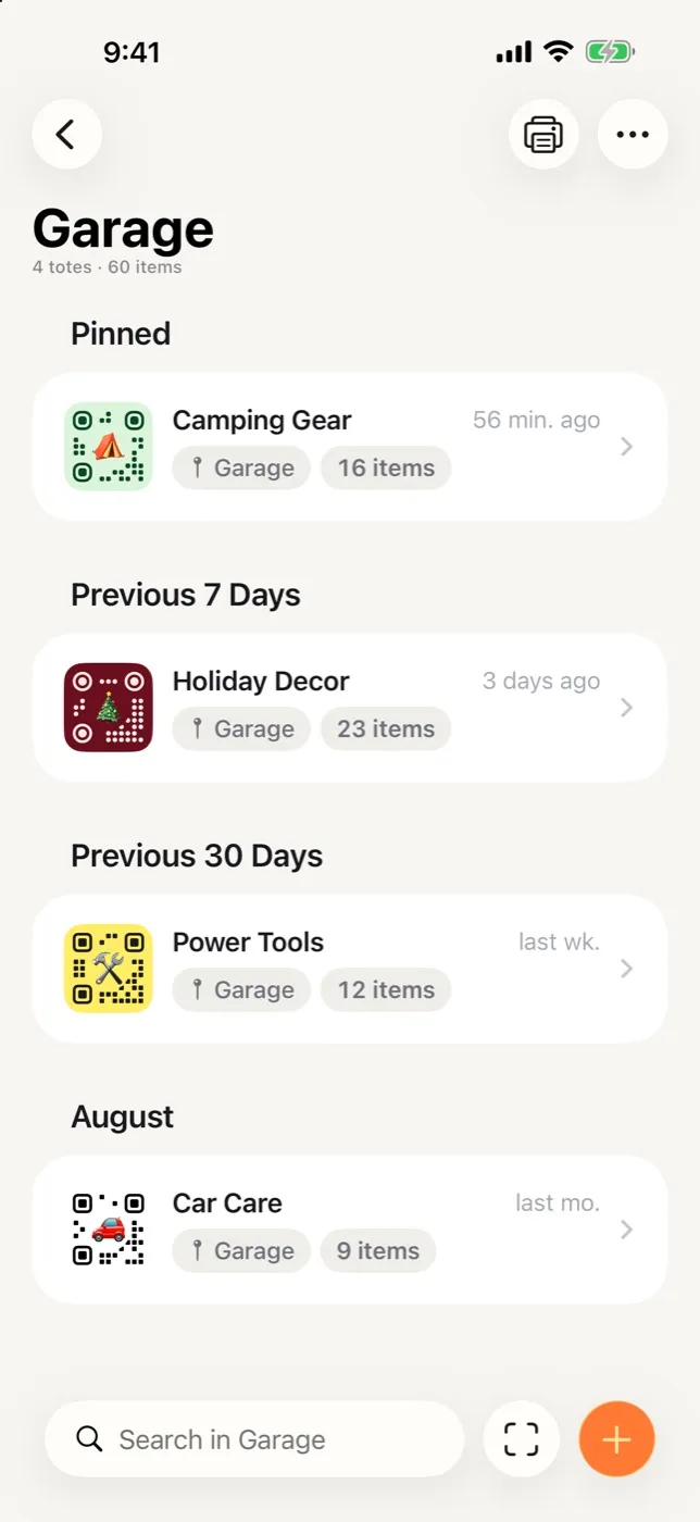
A place is where a tote lives: Garage, Attic, Bedroom Closet. They sit in a row of cards at the top of Storage, ordered by how many totes are in each one. Tap one and you get that place on its own screen, sectioned the same way, with a search field scoped to it. Search in Garage only looks in the garage, so you never have to wonder how wide the net was.
Places take no setup. You never create one, name it ahead of time, or clean it up afterwards.
A place exists because a tote says it lives there, and it disappears when the last tote moves out. Rename it once and every tote inside follows.
The Tote, All in One Place
Open a tote and the label comes first, drawn as a die cut sticker with the real QR code on it. Tap it to change the style, the colors or the emoji. The name renames in place, the place chip opens the picker, and a row of round buttons underneath holds Itemify, Print and Pin. Anything rarer sits behind the ⋯ menu, and long pressing a row opens that same menu, so there is one list of actions per thing instead of two.
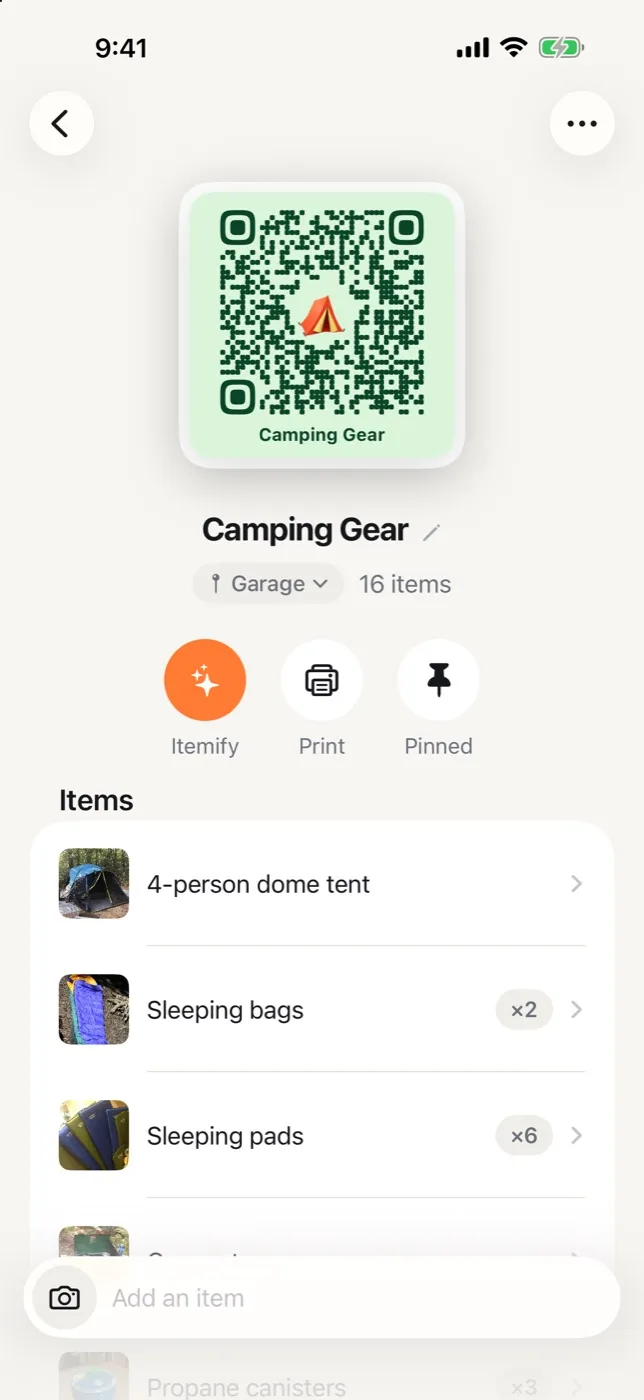
Adding items works like sending messages. The composer sits at the bottom of the tote: type a name, hit return, and the item lands while the keyboard stays up for the next one.
Tap the camera on the left and a photo attaches to whatever you are typing, with a name already suggested from the picture.
Items Hold More Now
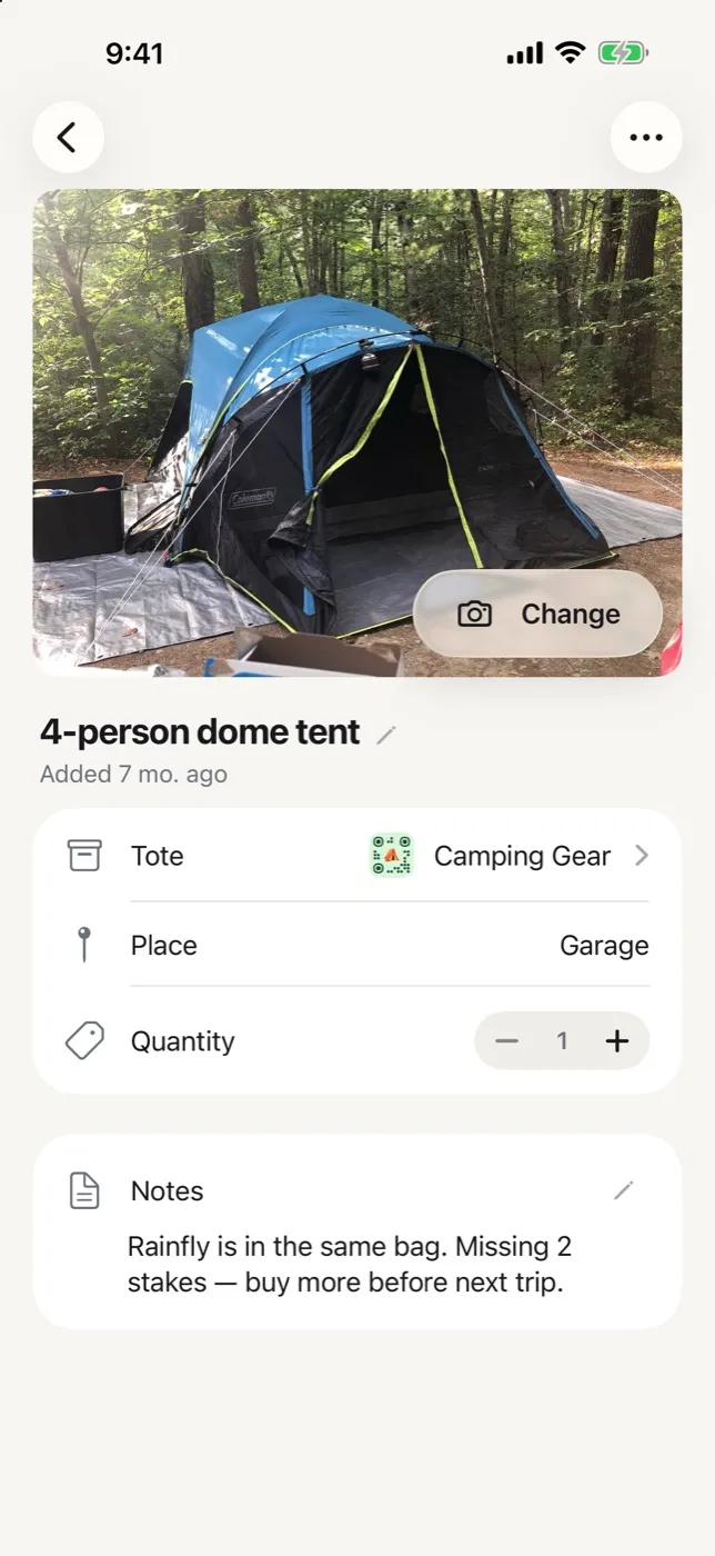
Every item has a quantity and a room for notes. Six sleeping pads is one row that reads ×6, not six rows.
Notes are the place for the thing you will forget: which bag the rainfly is in, how many stakes are missing. Search reads them.
The item screen also tells you which tote it is in and which place that tote lives, and moves it somewhere else in two taps.
Search Ranks Totes and Items Together
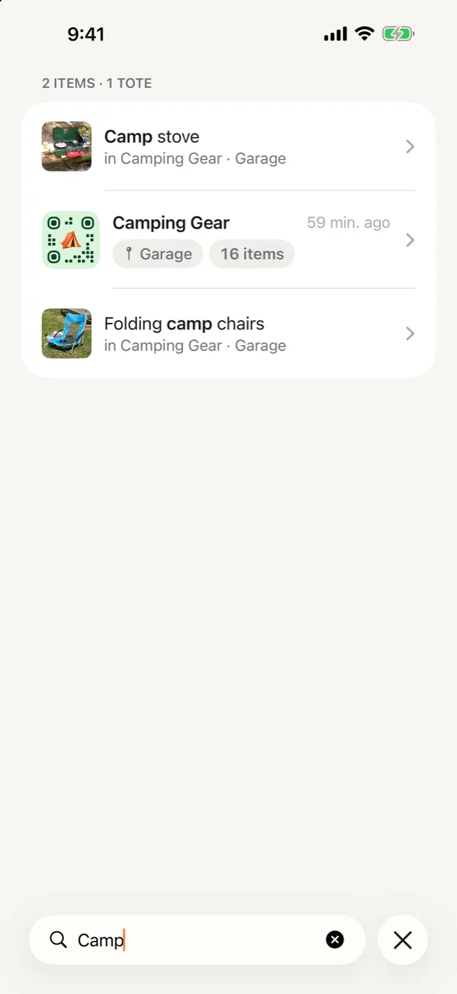
Type a few letters and matching items and totes come back in one ranked list, with the matched text in bold.
Every item result says where it is, tote and place, so most searches end without tapping anything. You read the answer off the results.
Undo Instead of “Are You Sure?”
Deleting an item, moving one, removing a photo, emptying a place: all of it happens right away, with a small Undo that hangs around for five seconds. No dialog asking you to confirm something you already meant to do. Deleting a whole tote still asks, since that one is worth a pause.
Dark Mode and iPad
Every screen has a dark version built from the same set of colors, not a filter dropped on top at the end. On iPad, the two-column layout grows to three: places in the sidebar, totes in the middle, and the open tote or item on the right. Rotate the iPad or run StowQR in a split view and the app keeps your place instead of dumping you back at the top.
Get the update
The new look is rolling out now on iPhone and iPad. Your totes, items and printed labels come across exactly as they were.